
Grids are prevalent on the various forms and modules in PIRO Fusion and are used for viewing and managing various entities such as Item types, Services, Workflows, Job orders, Purchase orders, Sales orders, Invoices, the Inventory, etc. Grids are also typically used for managing various sub-elements of these entities, such as Item type Subitems, Order items and subitems, Subitem Variants, etc.
Regardless of the forms where they are used, the grids in PIRO Fusion currently come in two main types of grid: an older version (such as the one found on the Inventory) and a newer version (such as the one found when managing Item types). We are currently in the process of transitioning all grids from the older version to the newer version, and most grids have already been updated to the newer version. However until we have fully updated all of the grids, we have put together this article that describes the common features of both grids and also the differences between.
Old grids
Let us begin by taking a look the old grid type, such as the one found when managing Inventory movements. The easiest way to determine that this is an old-type grid is by the separate ‘Filters’ bar above the grid which is distinguished by a dark background. Another hallmark of old-type grids are the action buttons that are used to perform individual actions on specific elements within the grid, such as Edit or Delete. The column where these buttons are located does not have any text in the column’s header row, and the buttons have an orange background.
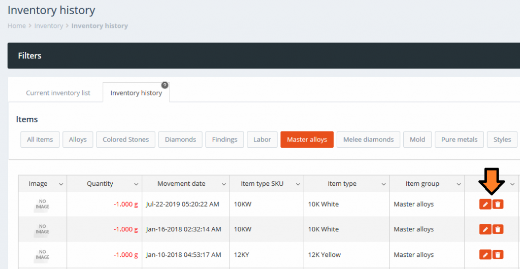
Inventory history grid
Clicking the ‘Filters’ panel above the grid expands the panel and displays the available filters that can be applied on the grid:
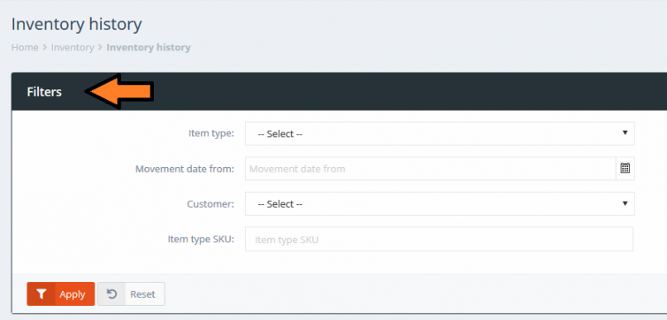
Inventory history – Filters
Clicking the ‘Filters’ panel again will contract the panel.
The columns from the grid can be enabled and disabled using the downward-pointing arrows from any of the column headers. This will bring up a small ‘Columns’ menu which shows all of the available columns that can be shown on the grid. The checkboxes on the left-side of each option can be used to show or hide the corresponding column on the grid.
The order of the columns from this menu always reflects the order of the columns from within the grid, so re-arranging the grid’s columns will be reflected on the menu.
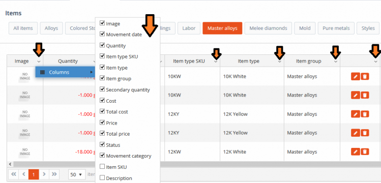
Inventory history – Enable and disable columns
Each column can be resized separately by hovering the cursor over the right-border of the column’s header and then clicking and dragging the cursor horizontally until you reach the desired column width. In the example below the ‘Movement date’ column has been made wider:
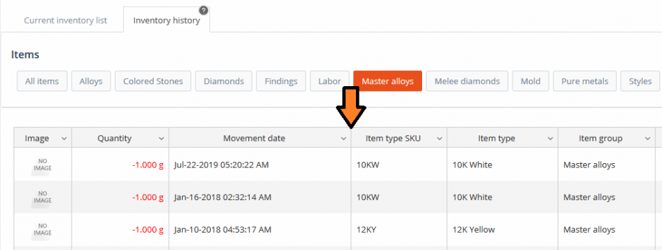
Inventory history – resize column
Columns can be re-positioned by hovering the cursor in the middle of the column’s header and then clicking and dragging it horizontally in its new position. In the example below the ‘Quantity’ column is being moved between the ‘Movement date’ and ‘Item type SKU’ columns:
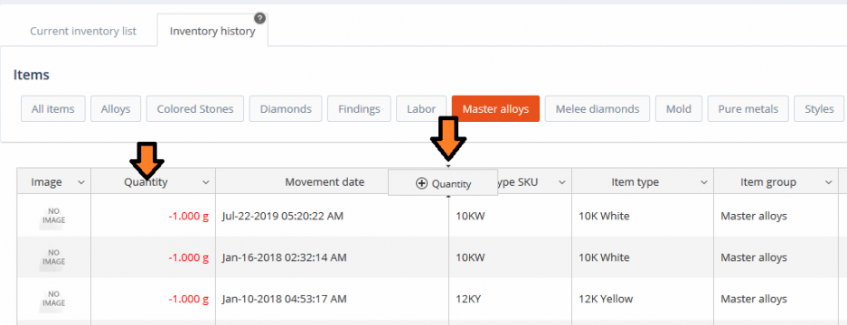
Inventory history – move column
Once you let go of the cursor the column will be placed into its new position:
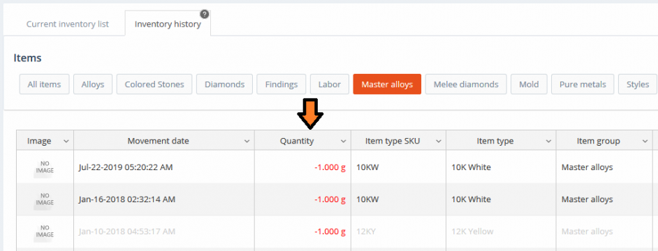
Inventory history – move column (finished)
Any changes made to the grid (visibility, resizing, re-positioning) are saved and remembered separately for each user and for each grid, so users can feel free to customize their grids in the best way that suits them.
New grids
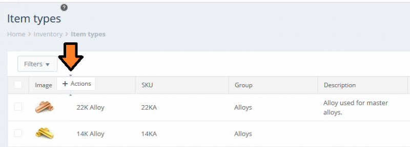
Let us now have a look at the same functionalities on the newer-type grids, such as the one used to manage Item types. Note that the ‘Filters’ panel has been replaced with a smaller ‘Filters’ button at the top of the grid. The action buttons that are used to perform individual actions on specific elements within the grid, such as ‘Edit’, have had their layout readjusted and are now more visible. They are now located in the ‘Actions’ column (by default this is the last column of the grid). The downward-facing button next to the ‘Edit’ button can be used to select additional actions that can be performed on the corresponding entity.
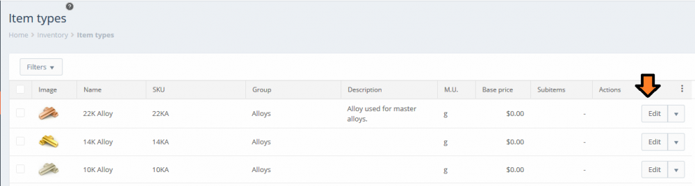
Item types – new grid
Clicking the ‘Filters’ button above the grid expands the filter options and displays the available filters that can be applied on the grid:
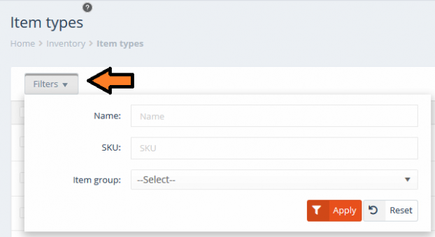
Item types – Filters
The columns from the grid can be enabled and disabled using the three-vertical-dots button from the right-side of the ‘Actions’ column’s header. This will bring up a small ‘Columns’ menu which shows all of the available columns that can be shown on the grid. The checkboxes on the left-side of each option can be used to show or hide the corresponding column on the grid.
The order of the columns from this menu always reflects the order of the columns from within the grid, so re-arranging the grid’s columns will be reflected on the menu.
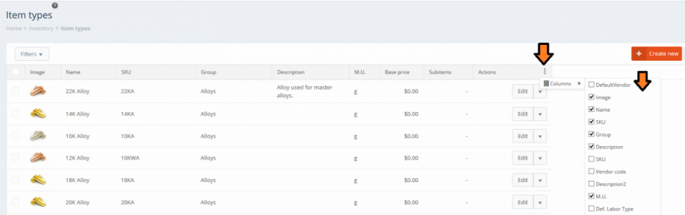
Item types – Enable and disable columns
Each column can be resized separately by hovering the cursor over the right-border of the column’s header and then clicking and dragging the cursor horizontally until you reach the desired column width. In the example below the ‘SKU’ column has been made wider:
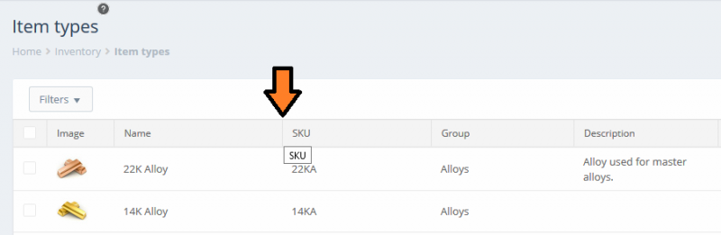
Item types – resize column
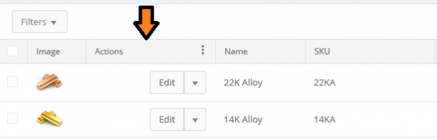
Columns can be re-positioned by hovering the cursor in the middle of the column’s header and then clicking and dragging it horizontally in its new position. In the example below the ‘Actions’ column is being moved between the ‘Image’ and ‘Name’ columns:
Item types – move column
Once you let go of the cursor the column will be placed into its new position:
Item types – move column (finished)
Any changes made to the grid (visibility, resizing, re-positioning) are saved and remembered separately for each user and for each grid, so users can feel free to customize their grids in the best way that suits them.
New type grids also allow users to perform various actions simultaneously on multiple entities, such as deleting or printing them. This can be done by using the selection (checkbox) column to select all the desired entities and then using the ‘Bulk actions’ button that becomes available next to the ‘Filters’ button to select the action. The available actions depend on the entity.
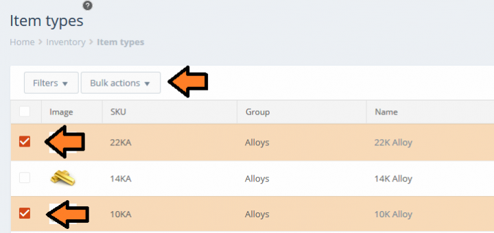
Item types – Bulk actions
Grids on portable devices
Portable devices such as tablets and smartphones typically have smaller screens compared to regular desktop or laptop monitors. PIRO Fusion will automatically detect the screen size of the device that was used to log in by the user. On regular sized monitors, the grids will be displayed in the formats that were described in the sections above.
On portable devices PIRO Fusion will display grids in a format that is more appropriate for smaller screens – in such cases the grids will be resized to make the text more visible and fewer columns will be made available, however the overall functionality for both old and new type grids will remain the same.
The grid changes made by users are also stored and remembered separately for each screen size. As such, any changes made by users on the regular-sized grids will not be applied to their corresponding smaller-sized versions, and vice versa. This feature is useful for users that frequently log into PIRO Fusion using different screen-sized devices since it saves them from having to constantly re-configure their grids every time they use a different device.